What is visual hierarchy?
Visual hierarchy is the structure and prioritization of information and elements in a design to show the viewer the order of importance. It uses design elements to guide the viewer through the content.
A design with no visual hierarchy will leave viewers confused; they would have to take in all of the content without any direction. The viewer will perceive everything as having the same level of importance.

Before creating your next logo, flyer, poster, social media design, etc., make sure to implement these principles into your next design.
Here are 4 quick principles to use to achieve visual hierarchy
Scale
1. Larger elements will appear to be more important
2. People see bigger things first
3. Making word/phrase/graphic/photo big and bold will draw viewer’s attention and generate hierarchy
4. Complement this with small elements based on your design

Colors
1. Bright colors will draw more attention than muted colors
2. More contrast will grab attention first
3. High contrast where you want attention first
4. Lower contrast for less importation elements

Position/alignment
1. Position/Alignment connects elements and helps create structure
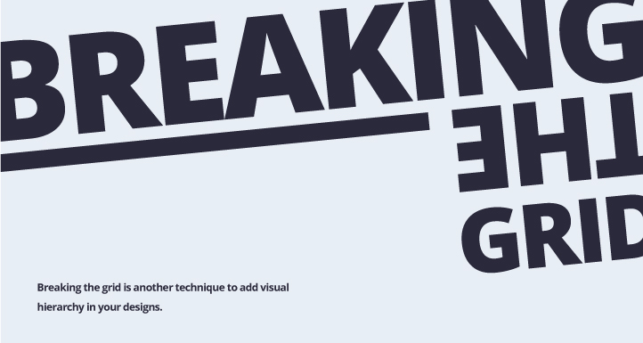
2. Use visual hierarchy by taking something out of the structure
3. Make it stand out in a different position by “breaking the grid”

Typography
1. Use headers to attract viewers attention (ex: newspaper headline)
2. Use subheaders to assist viewers and help them navigate through the content
3. Body text should be small but still readable.

Visual hierarchy is one of the graphic design principles every graphic artist should understand. Make sure to implement these principles into your next logo, social media design, website, flyer, poster, etc.
Need help with visual hierarchy in your designs? Contact us today and let’s start a conversation.


